
See the biggest culprits behind every delayed projects, and how...
Every logo tells a story. Same way, Astravue has a story to tell. Hear our logo story. Thank you in advance for reading.
We started with a simple experiment. We showed the following two cake pictures to a group of people and asked them to choose one. Can you guess which one they preferred?
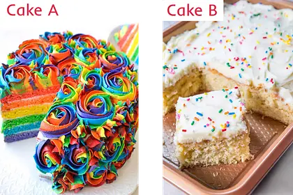
The majority chose the simple cake (Pic B) over the colorful one. This choice reflects a universal truth: humans often gravitate towards designs that are simple, sophisticated, and visually appealing.
This observation served as inspiration for the design of the Astravue logo. We wanted a logo that embodied simplicity and elegance — a design that could stand out, capture attention, and withstand the test of time.
However, crafting such a logo was no ordinary task. It had to tell a story — our story — one that resonates deeply with our brand’s vision and values.
The process of creating the logo was a journey of introspection. Our team gathered around a whiteboard to revisit and outline the core values and aspirations that define Astravue. This exercise was not just about design but also about reinforcing our brand’s foundation.
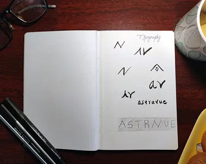
Armed with ideas from our brainstorming session, we turned to our dotted notebooks to sketch out concepts. Drawing inspiration from Japanese design philosophies, we aimed for a design language rooted in “Sophisticated Simplicity.”
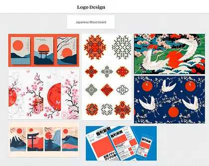
We adopted the “first principles” thinking approach, famously championed by visionaries like Richard Feynman and Elon Musk. By stripping away clutter, we distilled our ideas to their essence.
Saying “no” to things we loved but didn’t serve the logo’s purpose was a challenging yet crucial part of the process. After multiple iterations, we landed on a design direction we were excited about.
Our initial design featured two triangles. At first glance, it might seem overly simple, but the triangles had deep meaning. They represented the letters ‘A’ and ‘V’ — the initials of Astravue.
Additionally, they resembled a rocket launching upwards, symbolizing growth, innovation, and the idea that our products help users “take off.”
While we were pleased with the initial draft, our creative minds couldn’t stop there. We refined the design by adding a subtle curve to the rocket and experimenting with colors. This small yet significant tweak added depth and dynamism without compromising the simplicity we were striving for.
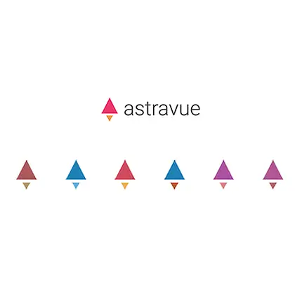
After testing various color combinations, we arrived at the final design. It perfectly encapsulates our brand’s essence while meeting aesthetic and design standards.
Our logo is more than just a visual identity. It’s a story of innovation, creativity, and perseverance. It’s a symbol of the vision we’re bringing to life and a promise to always aim higher.
Just like a well-executed project management strategy, the creation of the Astravue logo was a blend of planning, collaboration, and iterative refinement.


See the biggest culprits behind every delayed projects, and how...

See the biggest culprits behind every delayed projects, and how...

See the biggest culprits behind every delayed projects, and how...
See the biggest culprits behind every delayed projects, and how...